
DASHBOARDS
About the Dashboards
FEMA Individual Assistance and Storm Impact Dashboards
The Individual Assistance and Storm Impact Dashboards pair data on storm damage with demographic and social vulnerability indicators. This information can be used to evaluate community needs resulting from a storm, as well as to monitor how effective and equitable disaster recovery programs are. The Individual Assistance Dashboards draw on several large datasets to create indicators we can use to interpret how storms impact communities. The datasets are composed of the following: the FEMA Individuals and Households Program, the CDC's Social Vulnerability Index, and U.S. Census data.
Each Individual Assistance and Storm Impact Dashboard has five tabs, as well as a welcome tab. Each tab is explained below.
Storm Impact and Damage
This map shows the total number of FEMA individual assistance applications per hundred households. We are using this indicator as a proxy for storm damage — the higher the number of applications, the more widespread the damage. There are advantages and limitations to this metric, which will be discussed in greater length in a forthcoming report.

An example of this type of map. The image shows Louisiana after Hurricane Ida. - Darker areas indicate higher levels of storm impact.
Social Vulnerability
The CDC's Social Vulnerability Index (SVI) is a measure of a community's vulnerability to a disaster and its ability to recover. This tab uses SVI scores to identify the most vulnerable areas in a community. It can highlight extreme differences in vulnerability, even in small areas.

An example of an SVI map. Harris County is home to some of the most vulnerable and least vulnerable census tracts in Texas.
Storms and Damage
This map combines social vulnerability and storm damage to show areas that were both hardest hit and most vulnerable. This map can be used to illustrate areas that need to be prioritized for recovery programs and mitigation investments.
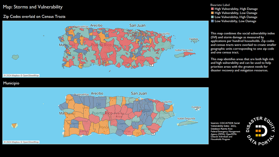
This two-variable map of Puerto Rico after Hurricane Maria shows that the areas of greatest need are largely in the interior of the island, where the most vulnerable populations suffered the most damage.
Equity and Outcomes
Understanding the characteristics of households that applied for aid can be useful when evaluating policy. For example, relief programs that direct most money towards homeowner assistance may be inappropriate if 60% of applicants were renters.
Many times, wealth or ownership status appear to determine outcomes in disaster funding rather than actual storm damage or need. These charts can be used to explore these relationships and show where inequities exist. It is critical to note that FEMA has not historically collected race and gender data on applicants; it has committed to doing so in the future, but no data has been released yet. These are clearly very important equity considerations, and we hope to have data in the future.

The Equity tab for each disaster has metrics both to describe the social status of households applying for individual assistance and equity indicators on how the program is administered.